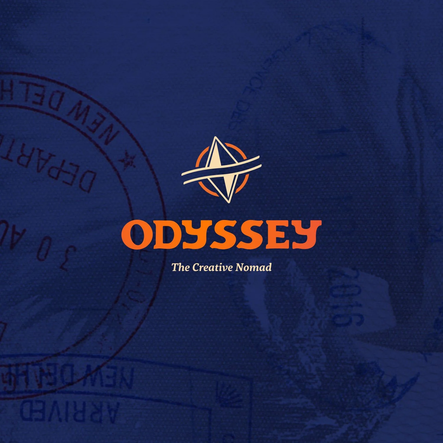
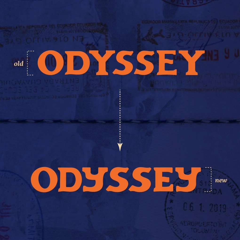
ODYSSEY: THE CREATIVE NOMAD
BRAND IDENTITY • TRAVEL • PRINT DESIGN • Typography
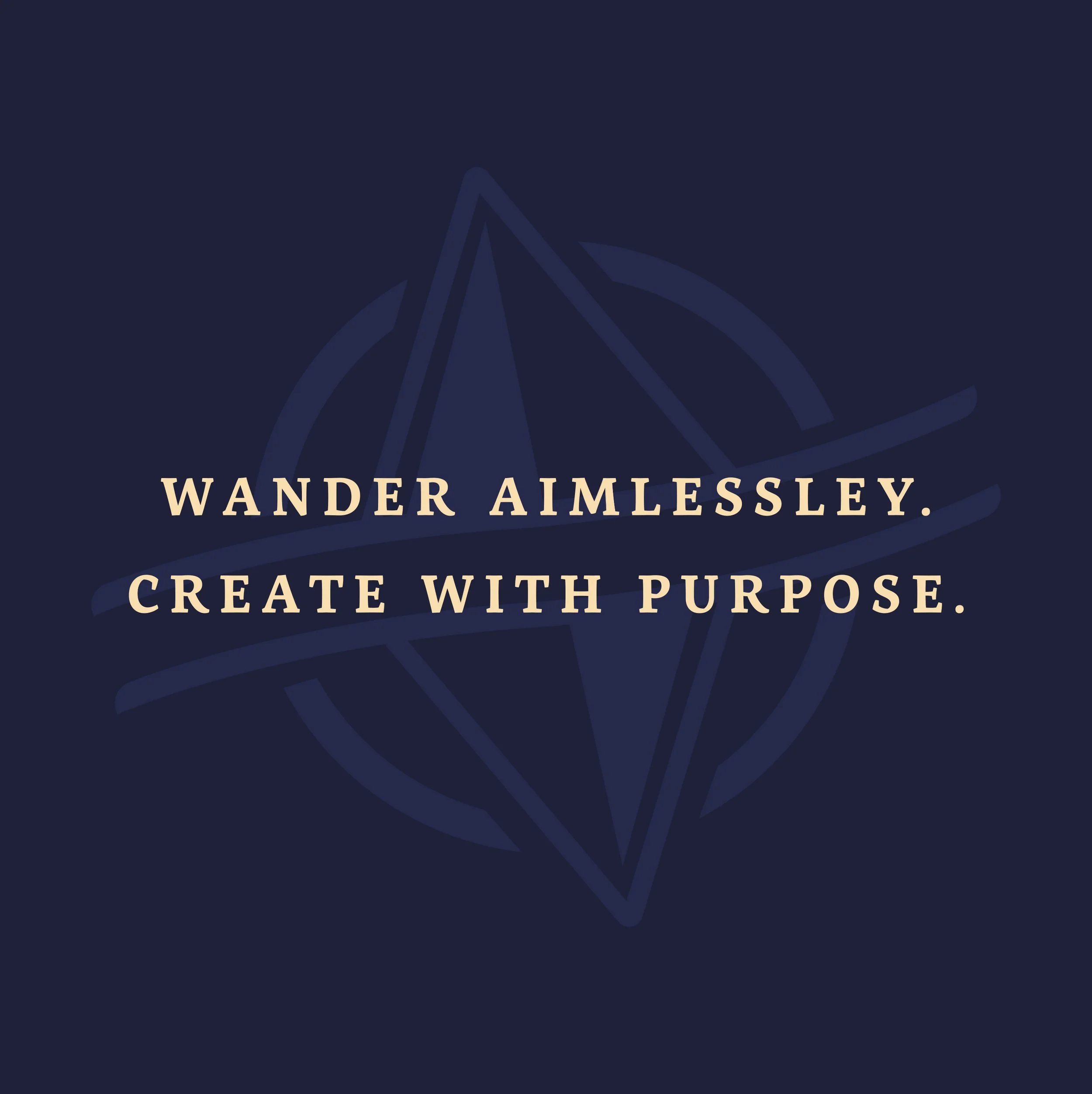
What began as a series of sketchbook travel journals developed for my undergraduate thesis evolved into an all-encompassing personal brand and creative project. It explores the intersection of travel, design, and illustration, and how movement through new places can shape more meaningful creative work. What started as a simple logo grew into an ethos guided by the motto, “wander aimlessly, create with purpose.” Through drawing, design, and reflection, the project documents both external journeys and internal exploration. It emphasizes self-reflection while fostering connection with people from different backgrounds and cultures. Ultimately, Odyssey is an ongoing exploration of self, place, and the shared human experience that fuels creativity.

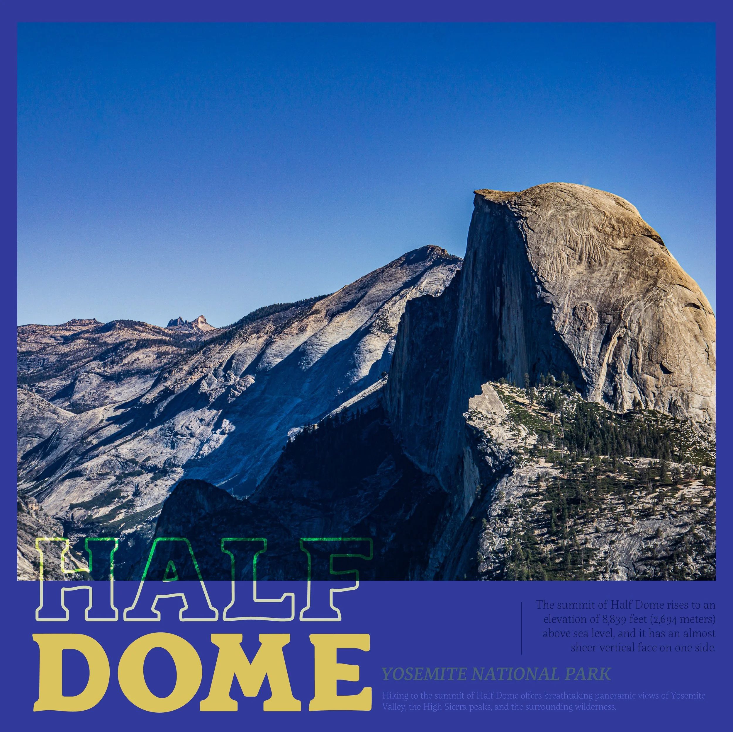
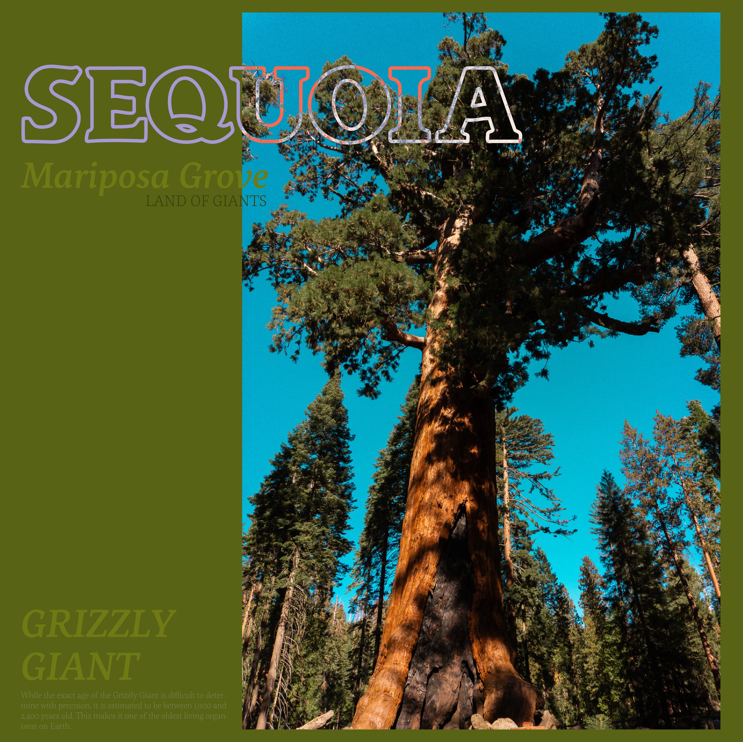
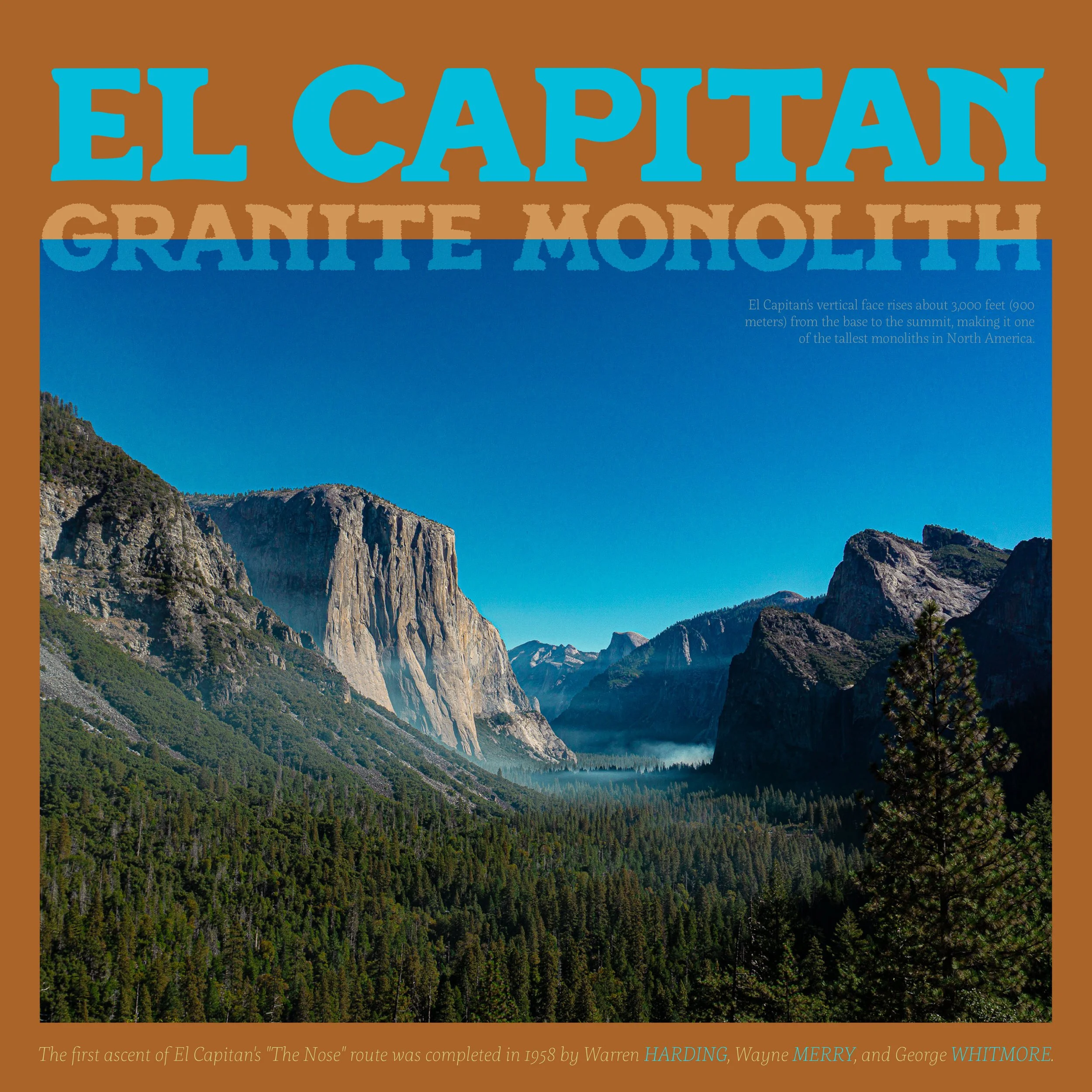
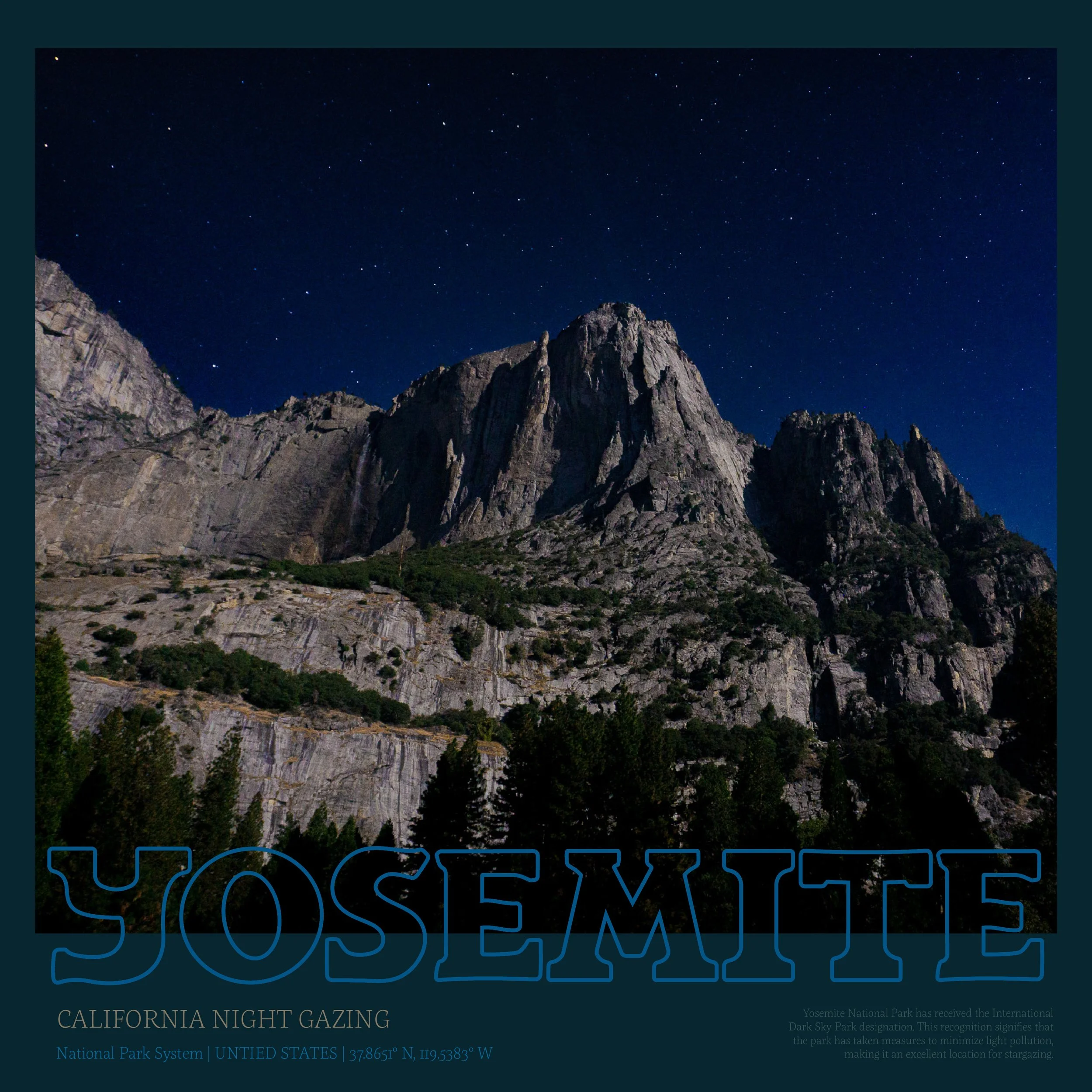
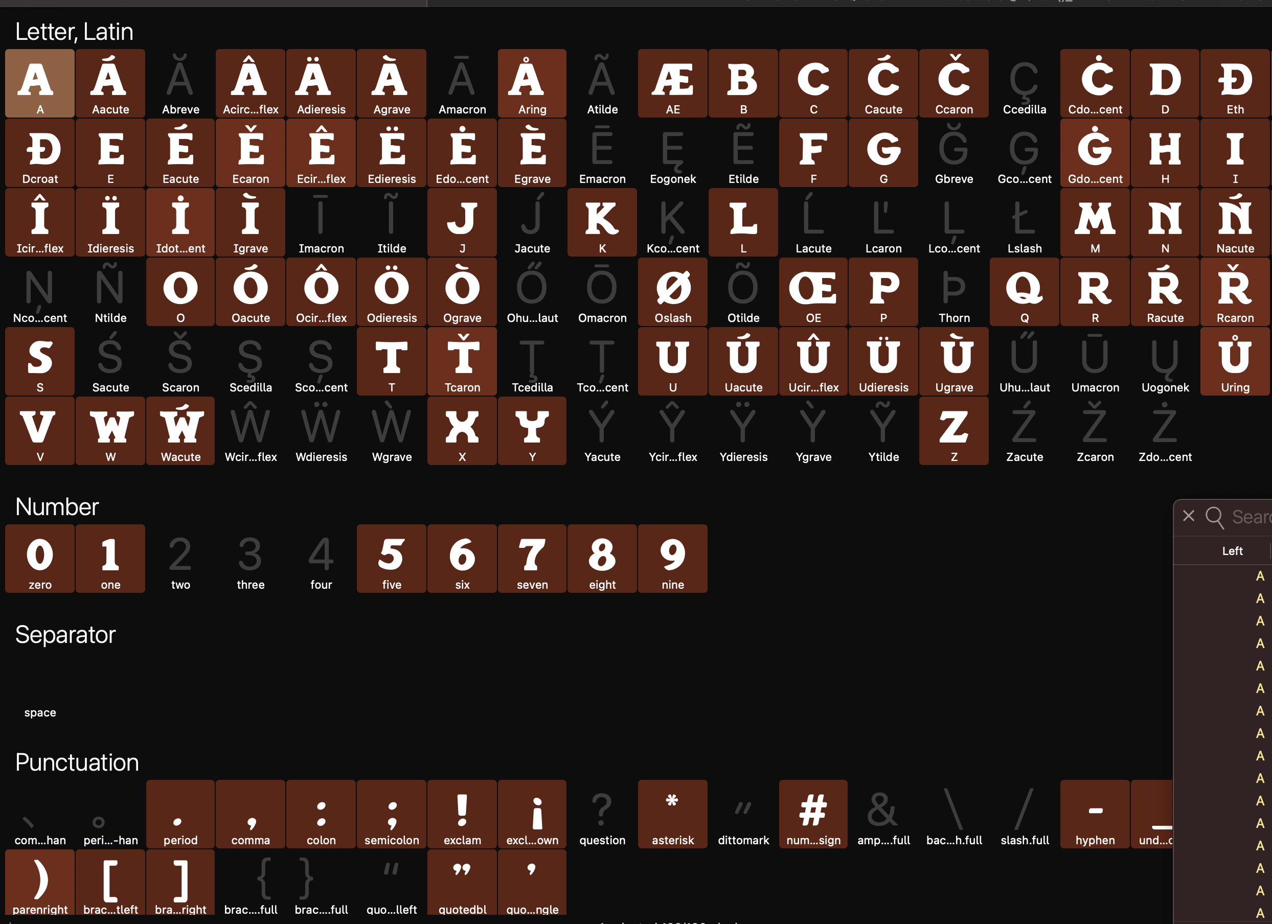
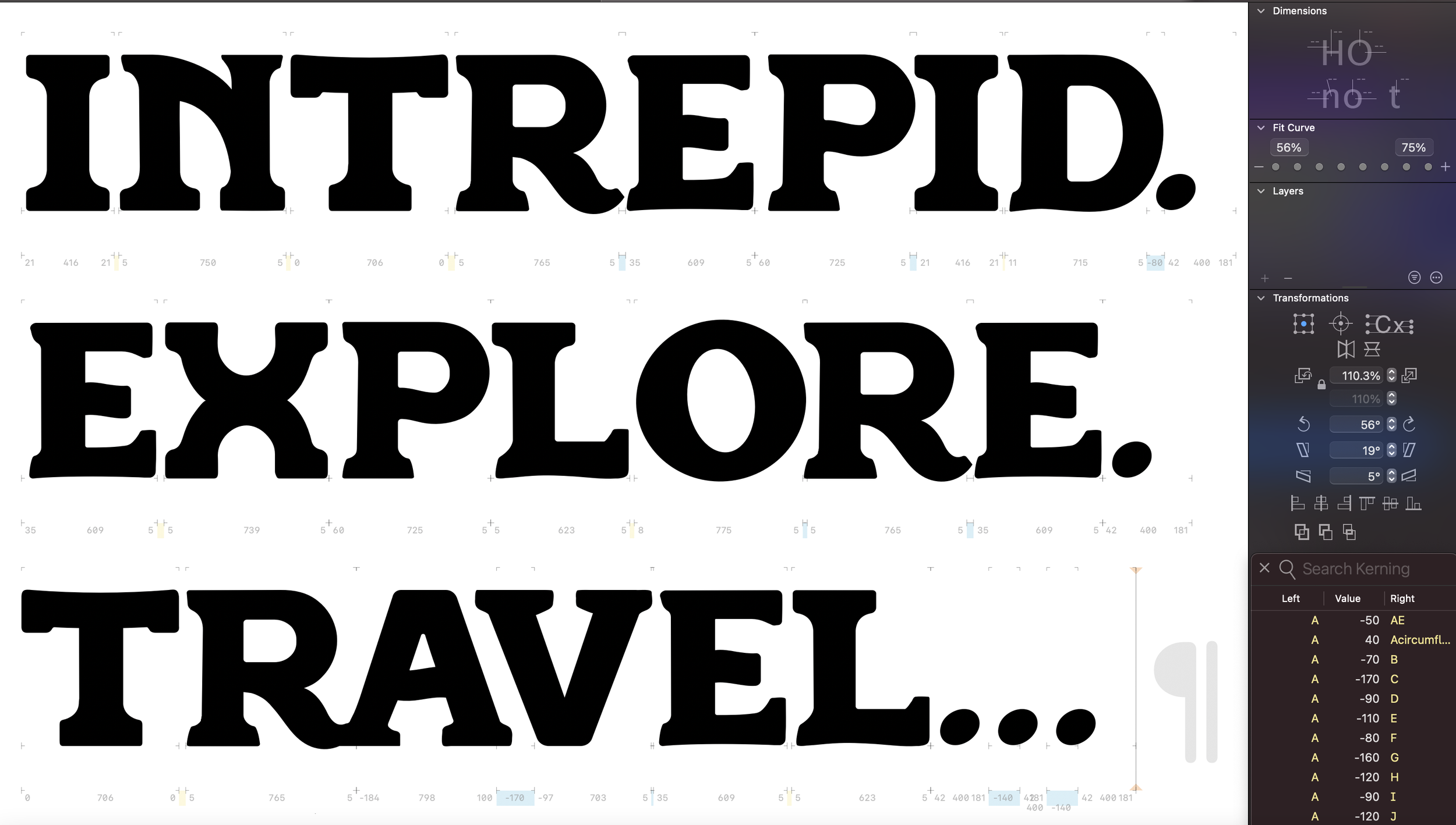
INTREPID: A DISPLAY FONT
My exploration and love of typography evolved into Intrepid, a custom slab serif developed while traveling across Europe. Inspired by bold letterforms and the tactile character of old travel journals, the typeface reflects the spirit of documenting journeys by hand. Intrepid serves as a typographic extension of Odyssey—capturing movement, memory, and the timeless act of recording where we’ve been.