LANDSCAPES & LETTERS: POLAND TO SPAIN
DECEMBER 14, 2022
Wow, it’s been a minute. I thought the last post was delayed. I like to out-do myself. Well, there’s good reason for it! The entire month of November was jam-packed with non-stop travel and exploration!
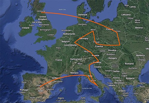
7 COUNTRIES, 13 CITIES
I covered a lot of ground by plane, bus and train. I started out in Warsaw, Poland and ended in Madrid, Spain. It was 5 weeks of meeting new faces, learning new customs and eating great food. While I did some sketching here and there, I really developed my reflexes of reaching for the camera rather than the sketchbook.
I started out in Edinburgh, flying east to Poland, and began heading west. I took a detour through Germany, then back south through the Alps, eventually making it to the Italian coast, where I spent a majority of the trip, then flew from Florence to Spain, where I then flew back to the UK.
LANDSCAPES: PHOTOGRAPHY
I didn’t do as much drawing on this phase of the trip. Unfortunately, I lost one of my sketchbooks in a restaurant in Old Town, Warsaw. Luckily I had photographed a majority of the pages. I ended up using my camera a lot more than I had in Scandinavia.
I enjoy photography strictly as a hobby and for now would like to keep it that way. I don’t have much of an interest in portraiture, since I like like to capture people through my drawings. I don’t draw a lot of landscapes, and figured photography could fill in that gap. Studying photography and lighting has made me understand atmosphere and mood, which in turn makes my illustrations better. Am I going to sell my photos to a gallery or apply for National Geographic? Probably not.
CAMERA GEAR
My camera is, by most professional standards, pretty basic. It’s a DSLR mirrorless Sony Alpha a6000. I really like this camera for it’s size and weight: it’s light and compact. I still use the two lenses that came with it, the 55mm & 210mm. For the trip, I carried the camera body, the 2 lenses, 2 extra memory cards, battery charger and a flexible tripod that I didn’t really use. Overall I keep my gear simple and light.
SMASH THAT LIKE AND SUBSCRIBE BUTTON
I’m a lousy travel vlogger. It’s something I dabbled with at the beginning of this journey but quickly abandoned. I’ve never felt comfortable filming myself, and the habit of recording everything doesn’t come naturally to me. I’m not even entirely sure how to record video on my camera – not something I’ve played with.
I realize platforms like Instagram and even Facebook now thrive on short bursts of watchable content and I admire a lot of travel vloggers and content creators that use those mediums to great effect. I subscribe to travel channels on YouTube that have helped me immensely on travel plans. I made a reel on Instagram detailing my time in Copenhagen and it became my most viewed post. I understand vlogging’s power, but writing things out in a blog form allows me to slow down and reflect on things more concisely. I guess I’ll miss out on that sweet, sweet algorithm for now…
LETTERS: TYPOGRAPHY
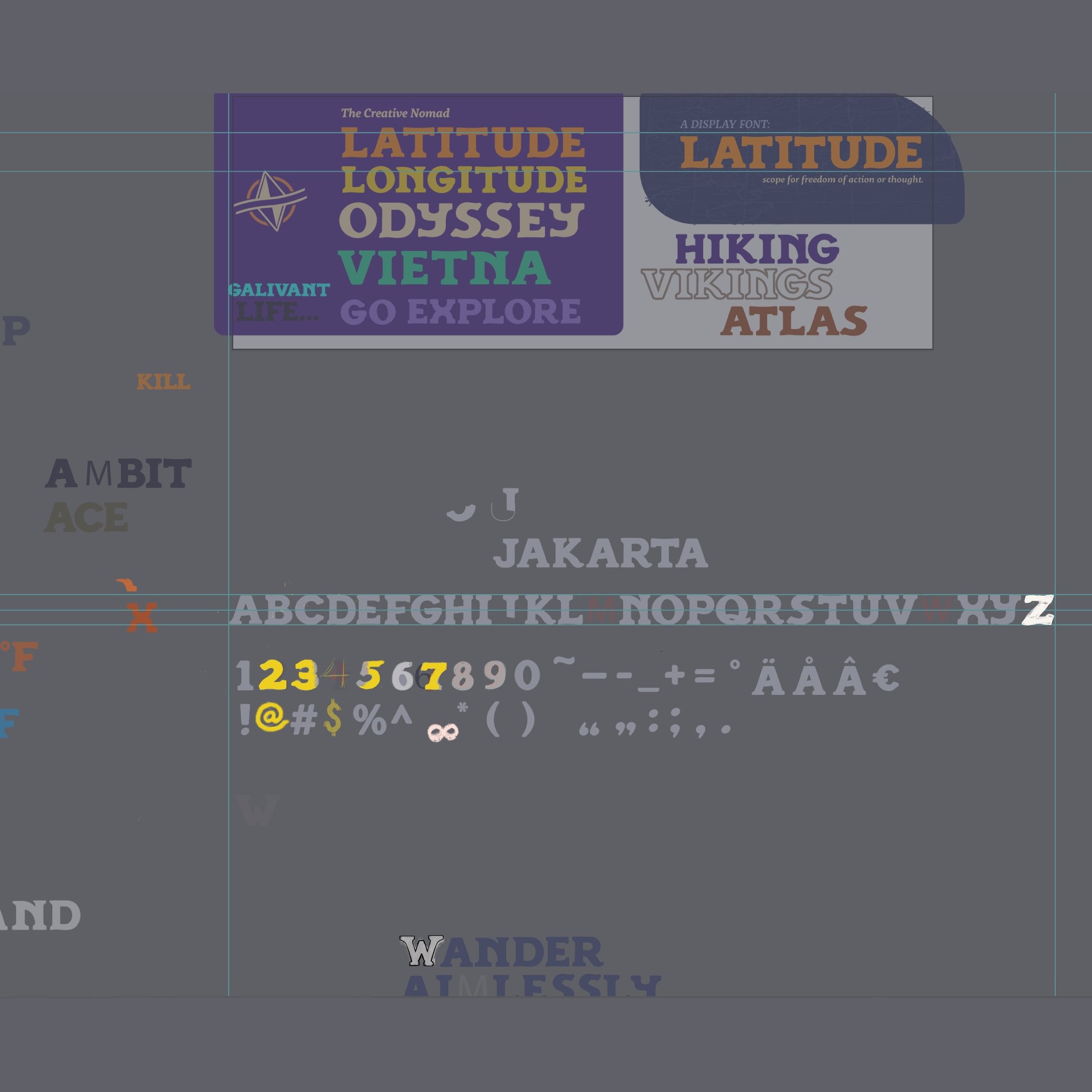
Over the past year, well before this trip, I decided I wanted to try my hand at developing a typeface. It would compliment my ongoing project Odyssey and its logo. I plan on using it for collateral pieces, and typography is always something I wanted to develop a deeper interest in.
During this phase of the trip, I took a conscious effort to be more aware of typography around me, especially in different environments. In some cases, things really stood out to me. Take this example below:

THE WARSAW MERMAID: HIDDEN IN PLAIN SIGHT
I noticed this while walking the streets of Poland’s capital. The city symbol is a battle-ready mermaid. In myth, she swam up Warsaw’s Vistula river into the city and after being rescued from a greedy merchant who wanted to sell her, she was rescued by a fisherman. From then on she vowed to fight and protect the city from attackers. The symbol can be found everywhere. On flags, t-shirts, statues in parks and museums. Her influence is apparent, even in the most subtle of places.
Warsaw’s public transit system’s logo features a ”T” that has an elongated stem making a tail and a notch to form a tail fin. It’s apparent the designer really took in account the history of the city when creating a symbol for its public transport system.